Walt Disney World in Retro
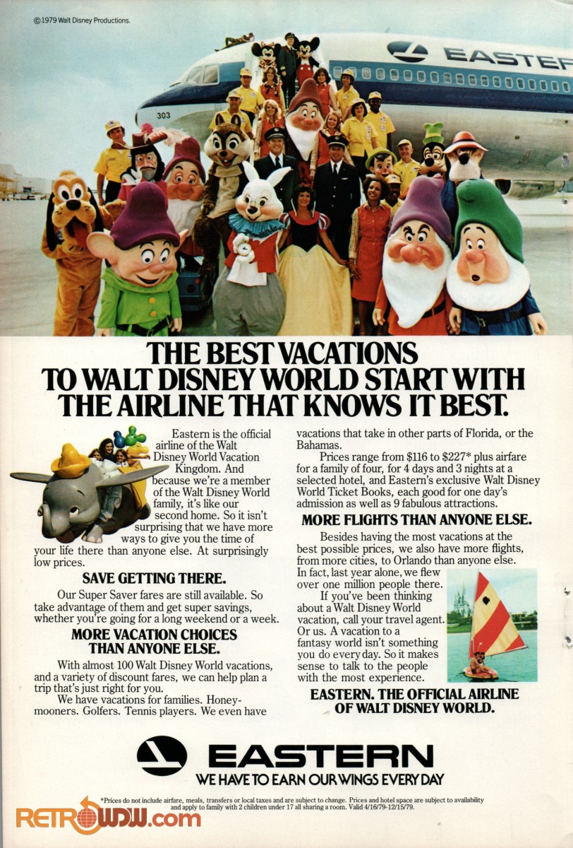
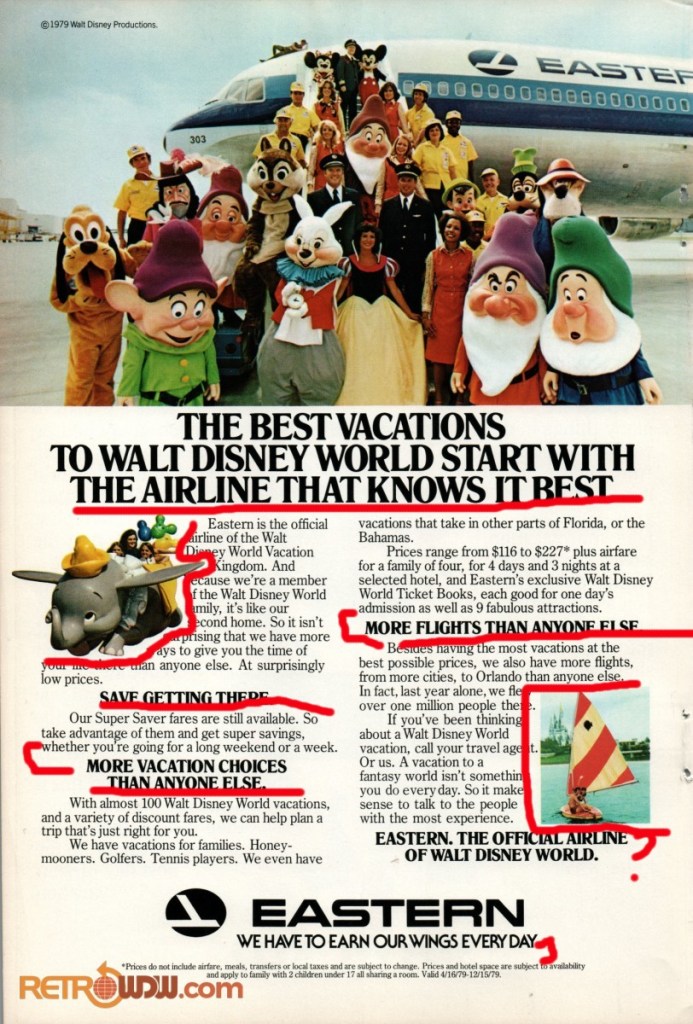
Since I am at Disney World this week, I found an old ad for an airline to use for this assignment. This picture originally came from a National Geographic magazine, but I am using it from RetroWDW.com, it is a fully owned subsidary of the Lake Buena Vista Historical Society website that memorializes retro Disney items. I will be analyzing this 1979 advertisement and comparing it to the 5 design components of: Contrast, Repetition, Alignment, Proximity and Color.
Contrast
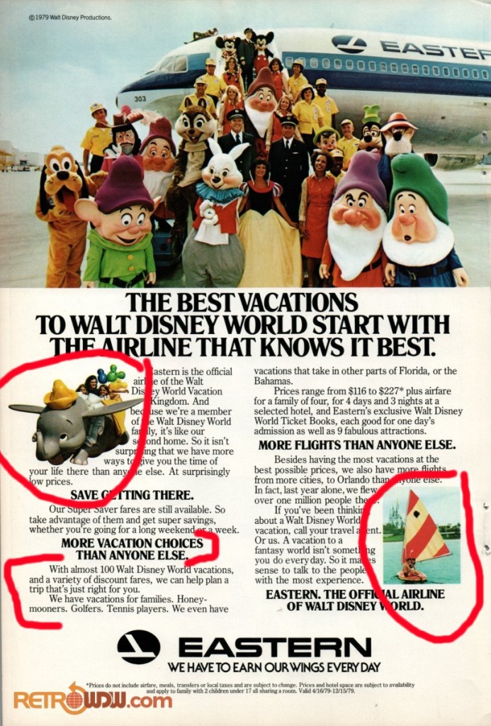
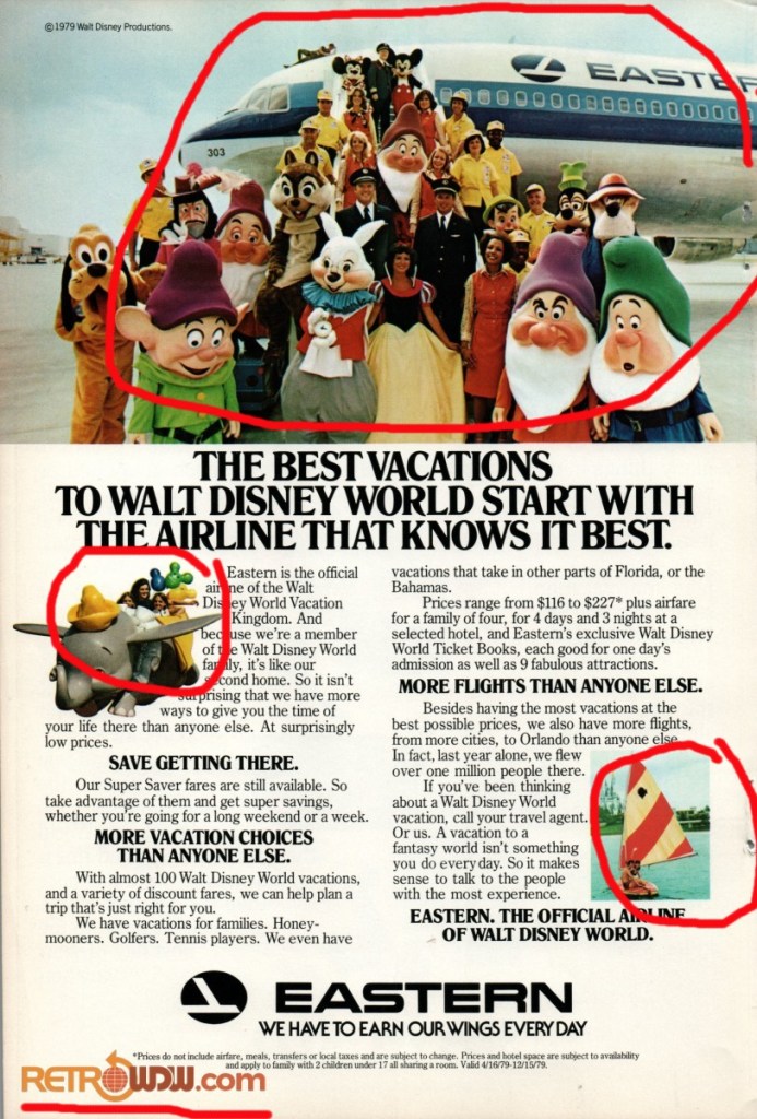
The biggest difference in contrast is the typeface of the subheadings and the body text. The bold and the normal text helps to establish the different paragraphs. There is also a contrast in picture designs with the dumbo picture being melded into the text giving it more lift and life, and the sailboat is simply a square picture.
Repetition
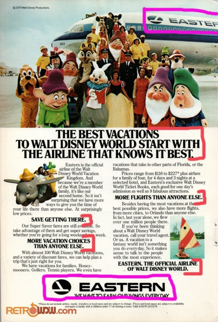
The same two typefaces are consistent throughout the ad, from title to fine print. Very uniform, very boring. The Eastern logo is also repeated on the plane (in partial) and at the bottom, bring greater emphasis to that company’s name.
Alignment
It seems we have two differing alignments here: Centered for the first column and Left-Align for the second column. This design could have benefitted from stronger lines by making the first column left aligned as well. That would have given the center space more definition. With the title, company name, and fine print being all centered, its too much and just everywhere.
Proximity
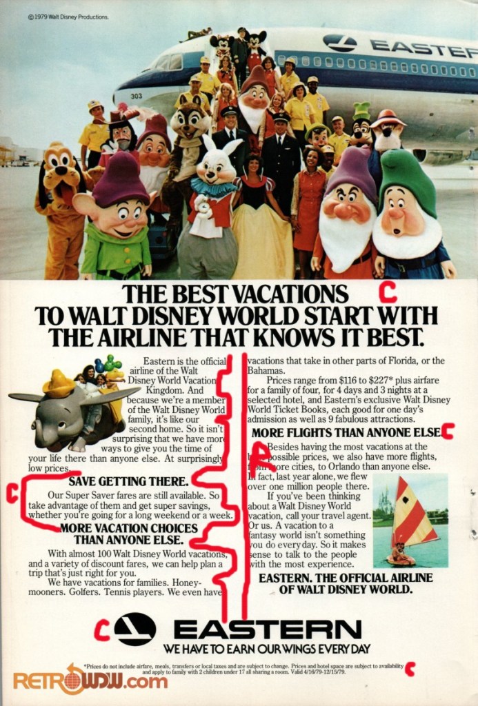
There is a lot of really close proximity displayed here. All the body text is directly under the subheadings. Even the overall text is really close to the title! The company name at the end is the only text that has its own space that seems to float there and slightly related to the fine print underneath it. I am confused about the last subtitle since it doesn’t seem to really be apart of the last paragraph but it is so close anyways. I would suggest giving that sentence its own line or own space.
The pictures are also really close in relation to their respective paragraphs, almost giving it a claustrophobic feel.
Color
There is a lot of bright colors added to this ad by the pictures, but other than that is it mostly black and white. Adding color to the subheadings would help make each paragraph stand out. And the enhancing the title with color could help to draw in the reader’s eye beyond glancing at the colorful pictures. Also, you have two major companies, yet I don’t see any of their companies colors on this ad.
A Change from 1979
From just the little bit I have learned in this class about visual designing, I can tell that the designing world has come a long way since 1979. Whether the designer was an amateur (probable because of all the center spacing) or if this looked good for a magazine back then, there are ways to make it better now. The half page, colorful picture of Disney characters definitely draws the eye, there isn’t much to hold the eye and keep you focused on the article. The whole advertisement feels too cramped and scattered. Overall, this ad is a good example of how designs can be made better by utilizing the 5 design tools of Contrast, Repetition, Alignment, Proximity, and Color.
