
This magazine spread is from InDesign Skills, an website that offers “tutorials, quick tips free stylish templates and inspiration. InDesignSkills is run by a community of graphic designers, illustrators and print experts.” I will analyze the spread by categorizing the different typefaces, explaining why the differences contrast, and determine if the pictures use the Rule of Thirds, Leading Lines, and Depth of Field.
Different Typefaces
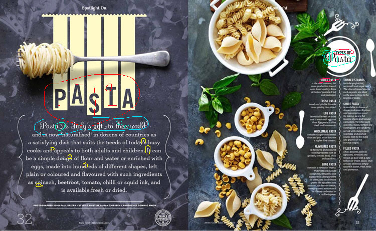
The first font outlined in red is used for the big title and subheadings. This typeface is apart of the Sans Serif family because there are no serifs at all, every stroke is the same thickness, and there is no thick/thin stresses. The bold, block style has crisp edges that cleverly compliments the crisp edge of drying “pasta noodles.” You would think that a title about pasta would be more homey or have an Italian flair instead of straight stiff strokes, but this title is so clever and unique it makes you giddy and definitely and eye catcher!
The second font circled in blue is a swirly, whimsical script typeface superfluous amounts of whorls. This gives a charming, delicateness that inspires one to think about the careful art of making homemade pasta passed down from generation to generation in a quaint Italian village.
The last font indicated with yellow is an easy to read Oldstyle typeface easily identified by the serif, bracketing, and minor thick/thin transition in the strokes. Perfectly suited to a large block of text.
Opposite Attraction
The bold, hard edges of the title sans serif is completely different from the loop-de-doo swirls of the subtitle that they balance and contrast quite nicely. Carrying over that contrast to the next page in the circle title helps pull it together. The Oldstyle text block pulls elegance from the subtitle script font while still being very easy to read. Giving extra space between the lines of text help provide a clean easy to section even though there is a lot of words. Since chefs and other pasta makers can be considered somewhat artists this is a good choice to play on the beauty and details within the strokes of text.
Rules, Rules, Rules
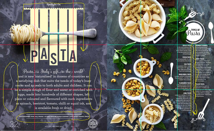
I have broken up each page into approximately thirds to help visualize where the photos are placed. On the left page, the spaghetti and fork is at the top third leaving plenty of space underneath for text while also creating a captivating and contrasting line across the title design. There are also thin stroked line details on the outsides of the block text creating an interesting parenthesis of sorts to the opening paragraph. The inclusion of more thin stroked lines on the top and bottom of the fine print is interesting. I’m not sure if it is overkill on the detail, or if it actually does help to define and distinguish the small print so it’s not forgotten. There is also a cute, little squiggle center line between the two text columns on the right page, which helps to lead the eye down through the words and mimics the ragged, top edge of the title pasta design on the left page. Both squiggle and jagged edge remind me of the edge of a lasagna noodle, and if that is what the designer was intending— very clever indeed.
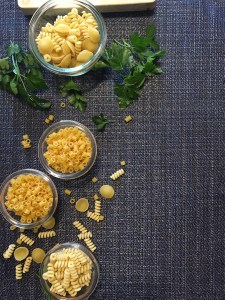
On the right side on the page the bowels of noodles are nearly centered on the left thirds line leaving the right third for the text. The larger bowel on top is given the top third which allows the bottom three bowls free reign over the lower left quadrant. Placing the smaller bowls of noodles off kilter emphasizes the careless look of spilled dry noodles and basil. The carelessness makes it look less organized and more like a regular, normal counter top ready for dinner preparations which is something a reader can relate to.
Swap Out
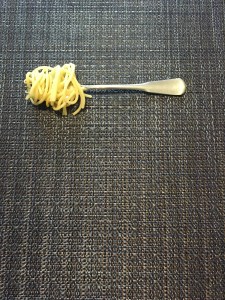
These pictures I took to be as close to the original as possible. I chose something food related, since I don’t live near any castles, beaches, nor anything interesting. I hoped it would be easy to recreate. We’ll be eating noodles for awhile.
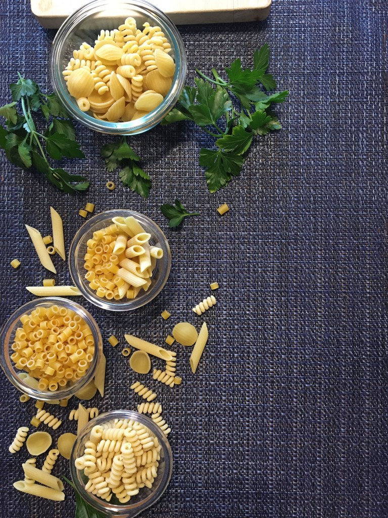
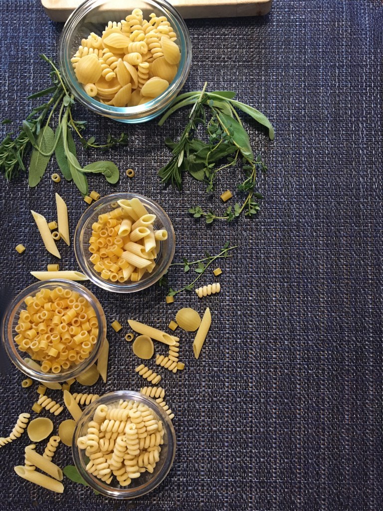
I chose different noodles and a variety of different herbs to create a more texture look. These adaptations I made would still work for a swap because the changes are small and the overall look remains the same.
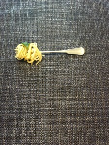
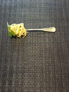
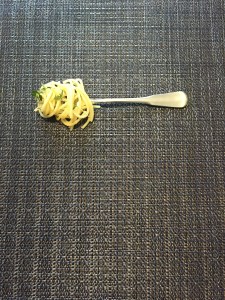
These variations of the spaghetti fork each include a different herb to bring a spring of green to the bland color. This still works as a great swap for the original in the spread because it has the same features, line up, and theme. And yes, I did in fact hand-wrap each spaghetti noodle around the fork (worthy of extra credit, yes?)
Al Dente
The principles of Thirds, Lines, Depth, and Typeface all work together to bring a professional, clean, and interesting piece. The way the designer spaces the photos and compliments it with the typography and arranged the information in an interesting manner of scattered, overlapping pictures, and elegant, strong text is creative genius. They have made a unique feeling of being in a real kitchen surrounded by pasta.
