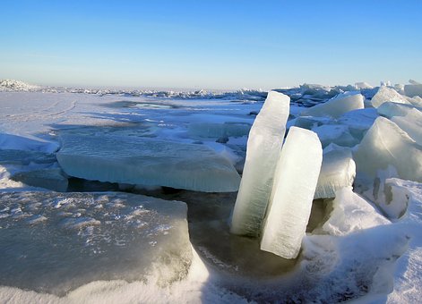
In this reverse engineer designing assignment, I choose a Evian water advertisement. According to Wikipedia, Evian water “is a brand of mineral water coming from several sources near Évian-les-Bains, on the south shore of Lake Geneva.” This picture is one of many that the Project Manager Arleen cataloged while researching the ad history of the strong UK company. Their advertisements show frozen landscapes and mountains that gives you the chills just by looking at it. I wanted to capture that feel in my new ad design and enhance the idea of the water coming directly from nature’s minerals.


Something Borrowed

The Ad showcases a stark contrast between all the light blue and white and the bright red directing your eye to the important things in red. Since the red is the contrasting color, it is used for repetition trying things together. There is also a contrast of imagery between the smooth, faint ripples of the droplet and the sharp, jagged mountain peaks. (Color and contrast identified in yellow.)
Actually, I would love to know the why behind the droplet. It seems out of place, unless it was to demonstrate the idea that their water is clear and fresh?
The typeset is interesting in that there isn’t much contrast in font. Even though it is a simple sans serif and everything is capitalized, with the thick vs thin and white vs red, there is enough interest there to draw the attention. Having the same character height also binds it together with the logo. (Shown in green)
The alignment would be all centered on the middle mountain peak but placing the water bottle off center and aligning the text body to the water bottle gives it an added interesting dimension. (marked in black)
Something Blue

The new ad that I created for this assignment incorporates the repetition of the color red, whilst adding a bright blue sky for added contrast and interest. Various shades of blue and white help make it look less mono toned as in the original and helps tie in the Photoshop water bottle. The logo is prominently displayed in the corner with the adjustment of the fading white background to help it stand out against the blue. (marked in yellow).
The contrast of a solid block of ice about the same size as the bottle, emphasizes the curves of the bottle clarifying the “chiseled out of ice” idea. (also marked in yellow)
The images being off center and the text right aligned help spread things across the ad without being boring and centered. (drawn in black)
The font choice is apparently not my forte. As shown in green, I tried to keep it the same as the original with it being all sans serif, all caps, and thick/thin, but it just looks amateur (which is, in fact, an accurate description of myself).
All To Say, Adieu
Both advertisements embody the ultimate expression of the Evian brand values: origin, health and youth. Actually, I would contend that my ad—displaying the frozen landscape and how young and healthy you would have to be to traverse to the source—does more to capture those values. Having the signature bottle of Evian water prominently placed in my ad and keeping the catch phrase “Drink to your health” does a great job of tying together the look of the original ad.
